The Impact
A distinctive, fun-meets-premium brand that is easy to recognize on delivery apps and memorable on the table. Content production is faster with plug-and-play templates, and every touchpoint—from sticker to screen—feels part of one cohesive voice.
.png)

The Core of Pie Pizza
-
Joy, Shared – Pizza as a catalyst for friendship, family, and chill.
-
Bold & Simple – Big type, clear icons, no fuss.
-
Craft, Not Gimmicks – 100% Handmade Dough as a trust anchor.
-
Always Craveable – Mouth-watering visuals and playful, inviting copy.


The Branding
-
Visual Identity – High-contrast Pie Yellow and Charcoal Black, a geometric wordmark hinting at a slice, stamp-style badges like “100% Handmade Dough.”
-
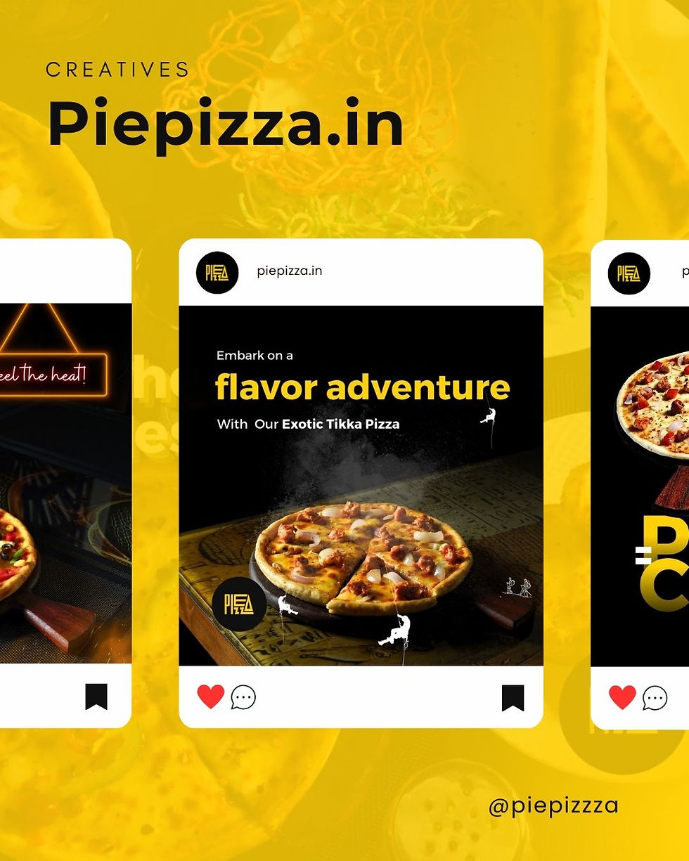
Social Media Creatives – Scroll-stopping headlines (“Embark on a flavor adventure”), tight food close-ups, modular templates for quick turnaround.
-
Photography Direction – Warm, cozy frames with real table textures, steam, and gloss; lifestyle mood over studio polish.
-
Packaging – Kraft-first system: bold typography (“Love at First Bite”), logo seals, and slice icons for instant recall across boxes and carry bags.
The Challenge
Stand out in a crowded F&B market with a system that’s playful yet premium, scalable for social, and cost-efficient for real-world production (boxes, bags, stickers).
Pie Pizza
We craft a fun, premium pizza identity that celebrates joy, friendship, and honest craft. Bold color, warm photography, and stamp-style graphics turn every slice into a moment worth sharing.


The Vision
Piepizza set out to be the neighborhood’s most lovable slice—handmade dough, big flavor, zero fuss—and to look as good on delivery apps as it feels on the table with friends.

